DRAWING PARALLELS

Any design process more or less follows the same road map to finally cater to a purpose or what we call as “Solving a problem”.

Case Study - MAKING OF THE RIDER'S SONG


Saddle up, Feel the wind, Brotherhood, All for one for all, Cult, Leh Ladakh, Freedom, Passion, Nirvana, were some of the key words emerging on a tissue paper at Star Bucks on a Sunday noon. This may get you wondering what was really going on. This was the kick-off meeting for making “Rider wali feeling” (A Biker’s Anthem) which was released on 15th August 2017. 

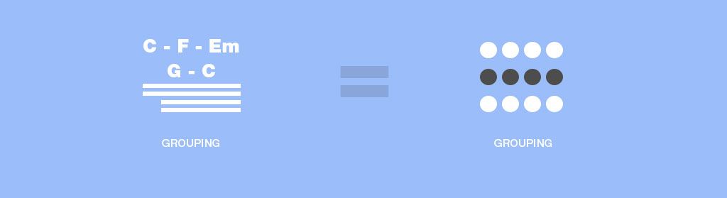
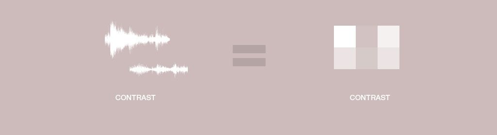
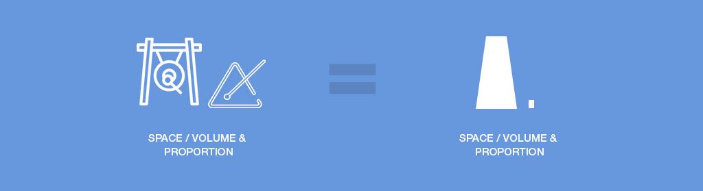
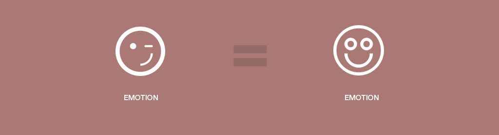
Before we dive into the main subject, I would like to point something out, which I realized while I was coming up a title for this article. “Drawing parallels”, might have some literal meaning. When I write “Creating UX = Creating MUSIC”, there are actually 2 parallel lines in form of an “Equal to” sign. Thus it signifies that you are comparing two entities and find similarities between them.

Moving back to the main topic, creating music and user experience have a lot in common and the most obvious amongst it is “Experience” which is the outcome. I was fascinated by this discovery, but only after the project was over. The resemblance in these 2 processes was so immense, so I thought of sharing it via this small piece or article.

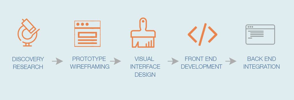
“Any design process more or less follows the same road map to finally cater to a purpose or what we call as Solving a problem”. This project was not so much about “Solving Problem” but it happens to be about creating experience.

So let’s get loosely familiarized with major steps of building a user experience process

To my surprise, these were the exact steps that I followed while creating music for “Rider Wali Feeling”. Would like to now share the stuff that I did under each of these steps. Just a disclaimer, not every aspect in Music has a counterpart under UX design. I am not trying to say that things are exactly similar, but the ones which are, will astonish you.


STEP 1 - DISCOVERY

2.5 hrs @ STAR BUCKS

The requirement:

The meeting at Star bucks was actually the discovery phase, where I was briefed about the requirement. Torq wanted to make a biker’s song for promotional purpose. This meeting lasted for around 2 and half hours and the outcome of which were a few phrases, key words on the paper napkins we had at the table.

The Persona:

Obviously this song was targeted towards all the bikers and bike enthusiast all over the country. The target users were sitting right next to me and were briefing me about what biking means to them, how they treat their bikes, like a girlfriend they say. I am a biker myself so I could relate to the sentiment.

The look and feel:

We kind of went over a few songs to agree upon how this song should sound like. For e.g. Energetic, Peppy, Hindi English mix, Should be Biker’s Lingo etc.

STEP 2 - PROTOTYPING

1 WEEK for the AUDIO WIREFRAMES


So for me to start working on the music, I required some lyrics. We had planned to hire a lyricist, show him all the key words and phrases that we had listed down. “We should look for someone who understands biking”, we all thought. I am not Nadeem Shravan who can build the tune 1st and then accommodate lyrics into it. I am not saying it’s bad, it’s just that I am not capable of doing it.

The thought “Writing the lyrics myself?” never crossed my mind. Remember? I am a UX designer, and music is just a passion/hobby, writing is nowhere in the vicinity of my hobbies. 

All the key words that we wrote on the Star Bucks tissue paper started jumping in my head. Next day I am on my way to office on my Duke 390, and I start mumbling something, with my helmet on. My own voice resonating inside the helmet, by the time I reached office I had coined the main verse of the song. So I quickly went into a conference room, and recorded what I was mumbling, and there, I had the 1st low fidelity wire frames for our song. I immediately sent it to the Torq team over Whats App.

So the audio wire frames were actually my voice recorded over a mobile phone. It was good enough for the TORQ team to get a feel of how the song would sound. We finalized the wire frames in around a weeks’ time and moved to the next step – Visual Design.


STEP 3 - VISUAL INTERFACE

2 WEEKS FOR ARRANGING/SEQUENCING

After the basic tune & lyrics (wire frames) were in place, it was time to get into the arranging/orchestration phase.
Musical attributes like Percussion instruments, melody, tempo, choice of instruments, Layout of the verses etc, appear to be very similar to the attributes of a Visual Interface Design for software application such as corporate color palette, Font style, grouping elements/layout, Theme, Shapes and forms of graphic elements.

While composing music you have to choose a lot of elements like instruments, tempo, Beat count, line repetition etc. These elements will be chosen based on the fact that the song is targeted towards bike riders, so it has to be energetic, attacking & with an attitude. Obviously you would not choose Santur or Sitar for such a song.

This process of choosing of elements does resemble with the way you would choose colors, textures, shapes & forms, & typography for a poster intended for a cosmetic promotion v/s a poster for a rock show, or a Poster for an art exhibition. These choices are made by keeping the persona in mind. Same is done while creating a piece of music

STEP 4 - DEVELOPMENT

2 Weeks - Mixing and Mastering the audio track


Development:

Typically when you have the Wire frames and the Visual Design done, the next step is to develop the design into a front end using HTML/CSS/Java Script/JQuery etc. Similarly I had done the Audio wire frames, completed the Audio design and now had to head to the development phase, where I had to get the vocals recorded and mix it with the orchestration, balance the levels, apply effects to polish the experience.
I had around 8 different versions of the final mixing, which every time went on improving as I did not have professional audio equipment. The entire orchestration is done on a laptop with a MIDI tool.
There are hundreds and thousands of parameters that you can control. Based on your technical knowledge you can tweak and turn the settings and achieve the desired result.

Testing :

Testing output on various speakers, and sound systems is very similar to how you test your app on a target device such as a PC or a mobile and on various OS. At times you may find that a Hi wattage music system gives good low frequencies but the mid frequencies are subdued. The portable Blue tooth speakers give good Mid and high frequencies but the bass is not as desired.

The way you would have a test environment for a code to be tested, you have something called as “Reference Speakers” to test the output. These speakers are sans-effect and help you to create an output which will play at an optimum audio quality across all the speakers

Final outcome

The observation lead me to believe that every design process has lot in common at an abstract level no matter which ever domain you deploy it in. If you can relate to this notion, you would be able to find the overlaps, which helps us understand and perceive design in more than one way.


There could be more to write about it, but I thought I would trigger this thought with this short article. Thank you for reading.


Enjoy the Video > 

SIMILARITIES AT ABSTRACTION 

Below are a few design principles based on which we can find the overlap between Music and UX/Graphic Design 

BEATS PER MINUTE (BPM) & GRID, RESOLUTION

In Music – we kind of define a rhythm pattern, which may be 4x4 or 7x4 or 3x4. That lays out the grid that the music needs to stick to. The melody also follows this grid as well.

There is also something as “Quantize” which is equivalent to “Snap to Grid” in UX & VD. Quantize snaps the musical notes to the grid and “aligns” & “distributes” notes just as graphic elements in a layout.

In Design - Before we start any design we define the canvas and the dimensions. What the resolution, the grid unit or the number of columns for a responsive layout.

LYRICS & CONTENT

In Music - The lyrics in a song basically carry the intended message. This message is delivered in stages which are in a form of the main verse, followed by stanzas. Its like a story being unfolded in a timely fashion. The lyrics also follow a pattern based on the grid or the BPM chosen for a piece of music.

In Design – The content in UX context also has to unfold in a timely fashion. The information is presented based on the choices that the user makes based on the task he is supposed to perform. A task is distributed across a series of screens/ modules which resembles the stanzas in a song. Just a thought.

PURPOSE & INTENT

In Music – One needs to understand the use case scenario which is referred to as “The Situation” in the “music world”, for which a song needs to be created. So you need to understand the purpose which the song needs to serve, Is it inspirational, romantic, patriotic, energetic, moral, philosophical. Knowing the audience and the situation, respective parameters are set and things get rolling.

In Design – Be it print or UX, knowing the user & understanding the use case scenario is the starting point to start the UX solution. One needs to understand the intent as to what is the expected result of this UX solution which means understanding the business requirement.

FIGURE & BACKGROUND - Gestalt's Law

In Music – Any piece of art, design, music has to have these 2 elements. The Figure/foreground and the background have to be distinguishable in some way. It helps to stay focus on the main intent and the background also compliments the leads (in music context).

In Design – This is one of the Gestalt's design principle (Figure & Background), which is very frequently used in various design disciplines for e.g. photography, graphic design, Advertising, Fine arts etc. You can play with the figure and background the way Gestalt  explains.

HARMONY WITH NOTES & COLORS

In Music - Vocal harmony is a very commonly used feature while creating music. Harmony whether it is vocal or instrumental always creates more depth and elevates the experience to a next level. Use of close musical notes in a particular formula helps to create harmony.

In Design – A similar formula gives us various color schemes based on the color wheel. Color harmony helps in achieving soothing visual results.

GROUPING  - Gestalt's Law

This section covers multiple design principles by Gestalt, for e.g. “Principle of Similarity & Proximity”. Human mind tends to group or sort things based on their similarities, or separate them based on their differences.

Rhyming is used while you write a song. The way a verse ends defines its grouping with the other verses that end with the same rhyming sound.

Changes in Rhythm patterns group together or separate out the chorus part or the interludes.  The fact that a stanza at the end lands on the root chord itself is an example of grouping or clustering elements together. 

INSTRUMENTS & TEXTURES

Each music instrument has its own quality of sound, which can be perceived in many ways like hard, soft, soothing, emotional, warm, metal etc. It’s the sound and not a musical note. It’s a character that each instrument emotes.

Same could be true with various textures that are achieved in graphic design with use of colors and their application pattern.

CONTRAST - NOTES /COLOR/SHAPE

In the context of music, contrast can be used in various ways such as, raise or drop in volume level, Using instruments of different sound weight like a Cello and a Santur, sudden variation in the tempo which also creates a contrast. A pause in the song is a contrast which emphasizes a particular moment in the composition.

In design contrast is depicted by Color, Shades, Shapes, Sizes, Scale, texture and Location etc. which I feel pretty close to what we do in music.

DELAY/ECHO v/s REPETITION

You can relate to this one directly. Echo & Delay are often used in music, some time to convey space, volume or at times just as an audio effect. When we use repetition in design it almost is like an echo. Consider a fading off echo, which resembles with a gradient where the color fades off.

WEIGHT

We perceive sound in various ways depending on the characteristic of the audio and its source. When you hit the kick of a base drum, you get a heavy sound with a lot of low frequency, as opposed to if you hit a snare which creates mid frequencies mostly. Cymbals create high frequency sounds which are perceived as light tones. On the other hand we have obvious parameters which emote weight in visual design. Weight in design can be achieved by parameters like colors, shapes, font, position etc.

VOLUME / SCALE / PROPORTION

The sound actually can convey space and volume. Probably that is why the “reverb effect” in most of the sound editing tool have presets such as “Small Room, Hall, Rich Hall, Cathedral etc”. A gong will convey a larger space/volume as opposed to a triangle.

Design also conveys space and volume and proportion with usage of appropriate shapes forms and size.

EXPERIENCE - EMOTION / SATISFACTION

Ultimately it’s about the right experience that needs to be delivered. Music has to reach the listener at an emotional level to be able to make an impact. Same is true with interfaces/UX. Being able to understand the mental model of the user, empathizing and identifying the problem well, leads to an effective problem solving. Experience is the only way that you can win users/listeners approval.